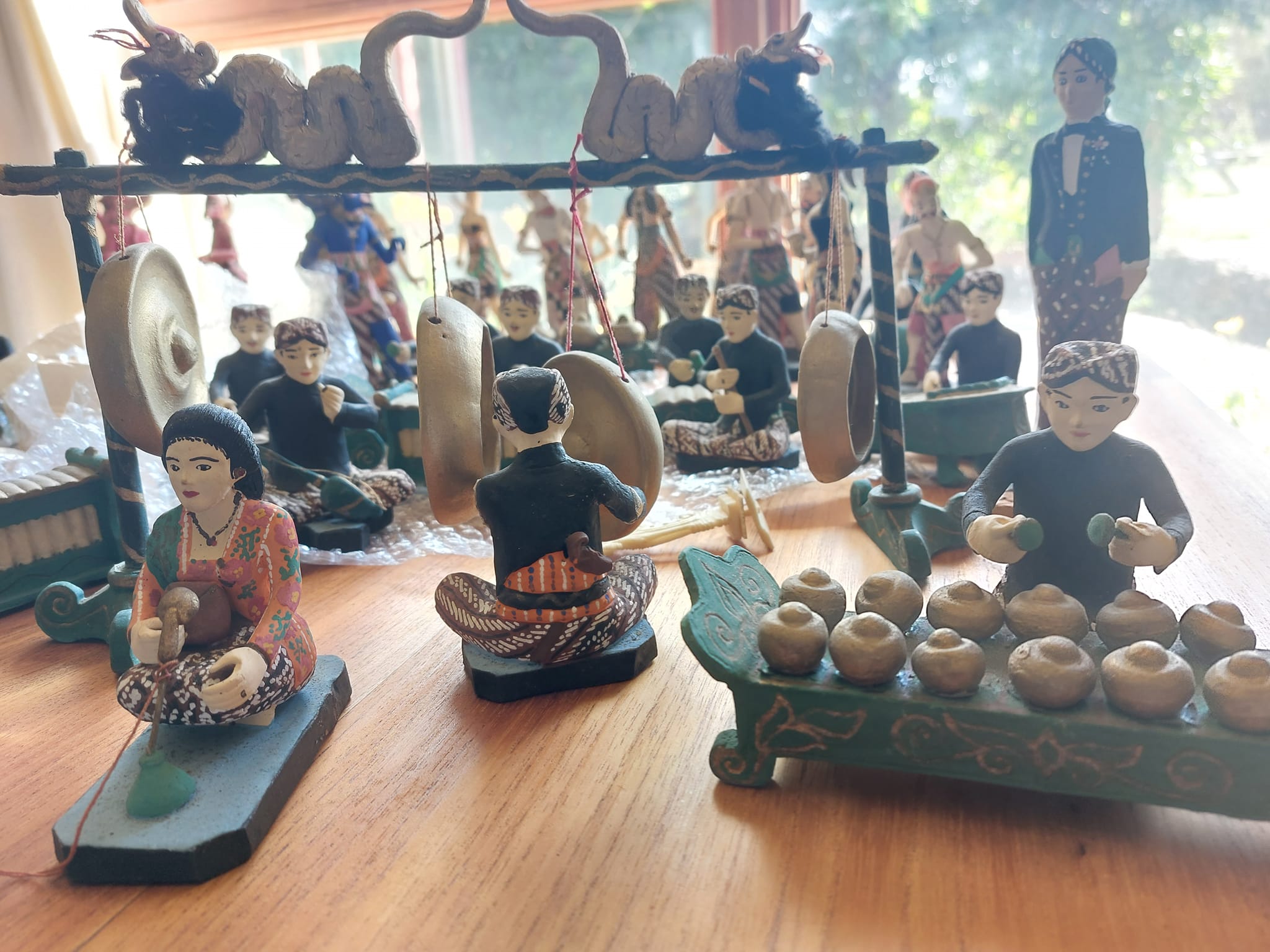
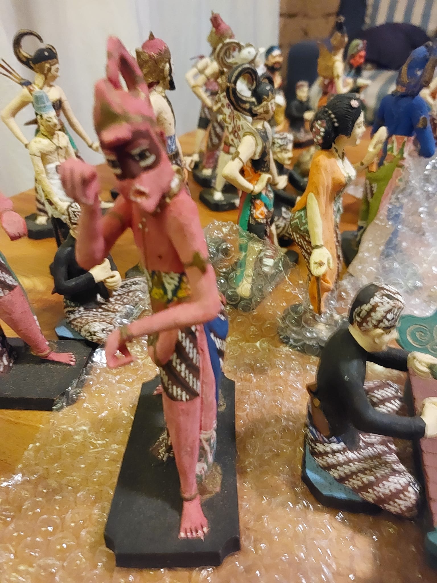
Born in Indonesia(in Jakarta) where my parents were working at the time (my younger sister Camille was also born in Indonesia, but in Surabaya, in East Java), I grew up in France and Australia amidst many reminders of Indonesian(especially Javanese, but also Balinese) culture, which my parents loved. The wayang plays, in their different forms(the puppet ones such as wayang kulit, wayang klitik and wayang golek, and the wayang orang, played by people) was a great love of theirs, along with the haunting music played by the gamelan orchestras.
They had already given me one unique treasure: the handwritten script of a particular wayang play, written down by a Javanese dalang(master puppeteer) in Javanese and then translated into modern Indonesian and English(both languages my parents spoke fluently). And now I have another Javanese treasure, gifted by my father and carefully brought here from France by my brother: a totally gorgeous set of exquisitely-painted clay figurines which my parents bought in Yogyakarta many decades ago, depicting a wayang orang performance with a full accompanying gamelan orchestra. They are absolutely unique pieces: I have never seen any other like them–including on the internet 🙂
As a child I was completely enthralled by this beautiful miniature world and would stare at them for ages, imagining their stories, hearing in my mind the music they played, the way the dancers moved…Many years later, as an adult with my own children, ona visit to Central Java, we went to a gorgeous moonlight ‘wayang orang’ performance of the Ramayana Ballet, in the ancient temple complex of Prambanan and it was like watching those figures world come to life…
It is just so wonderful that now this beautiful miniature world has found a new home with us here!
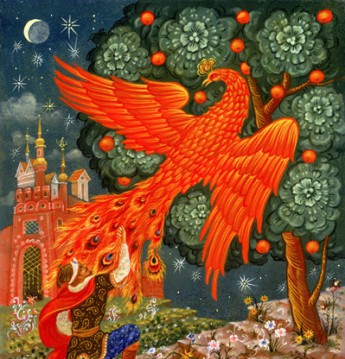
‘Wayang’, by the way, means ‘shadow’, or, metaphorically, ‘imagination’: a fitting name for this most extraordinary of art forms…
I’m absolutely delighted to announce the forthcoming arrival of the new Pardalote Press production, my latest collaboration with the wonderful Lorena Carrington!
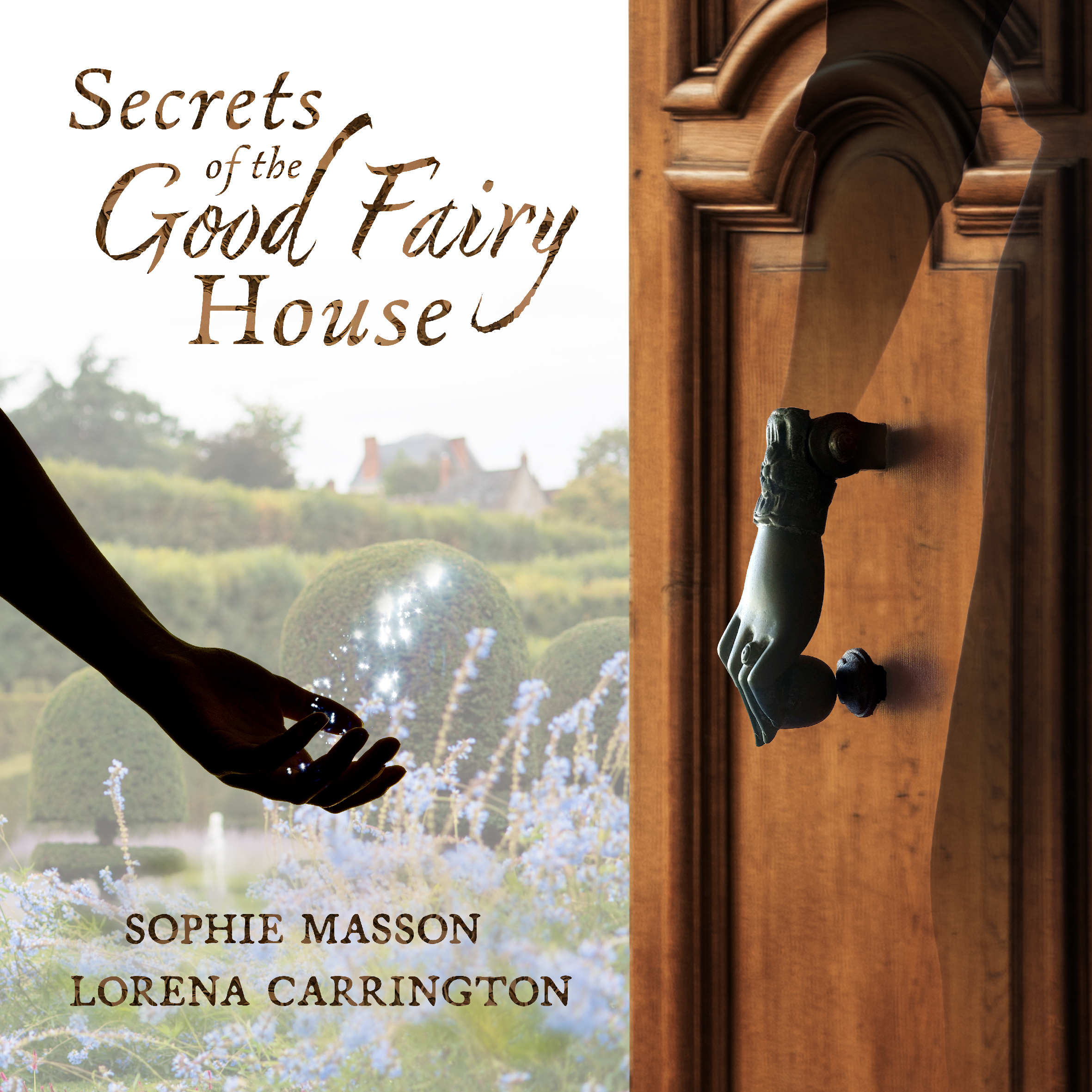
It’s a beautiful little book titled Secrets of the Good Fairy House, which will be out at the beginning of June and distributed nationally through our distributor Peribo. Below you can see the book’s gorgeous front and back covers which Lorena created, as well as the lovely page Peribo have for the book in their June catalogue.
Secrets of the Good Fairy House is a unique exploration in words and images of the magic a beloved childhood home can confer on people, through its sheer atmosphere and the objects in it too. Both in words and images, it’s a mix of memoir–about my childhood home in rural France and Lorena’s in regional Victoria–and fiction, to create what we hope will be an enticing, imaginative blend. Each page features a space or an object or an aspect of the good fairy house, and, as well, there are interactive elements at the end: an encouragement to create memory maps(with ours as samples), ideas on how to use the ideas and concepts in the book to create your own exploration of your own ‘good fairy house’, and a maze game, for a bit of fun 🙂 We absolutely loved creating this unique little book, and we hope many readers will take it to their hearts too. It’s for a general audience, for adults as well as younger readers, and makes a great gift too.
Secrets of the Good Fairy House is a beautiful small square book of 48 pages, in full colour, retailing at $25. The ISBN is 9780645563429. It will be available in all good bookshops across Australia, and can also be pre-ordered, via your local bookshop, or directly via our website.
In this lovely post, Lorena writes about how she created the stunning visual world of the book.
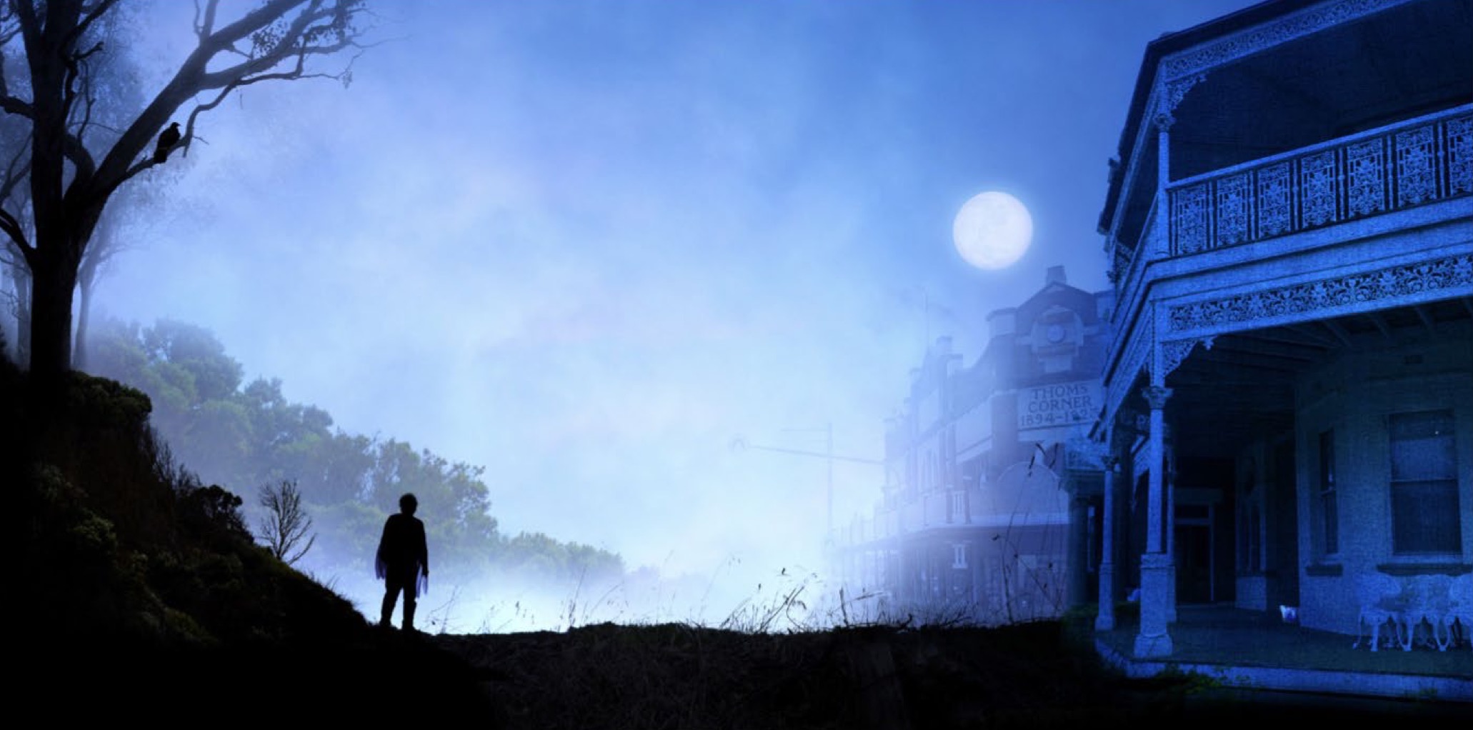
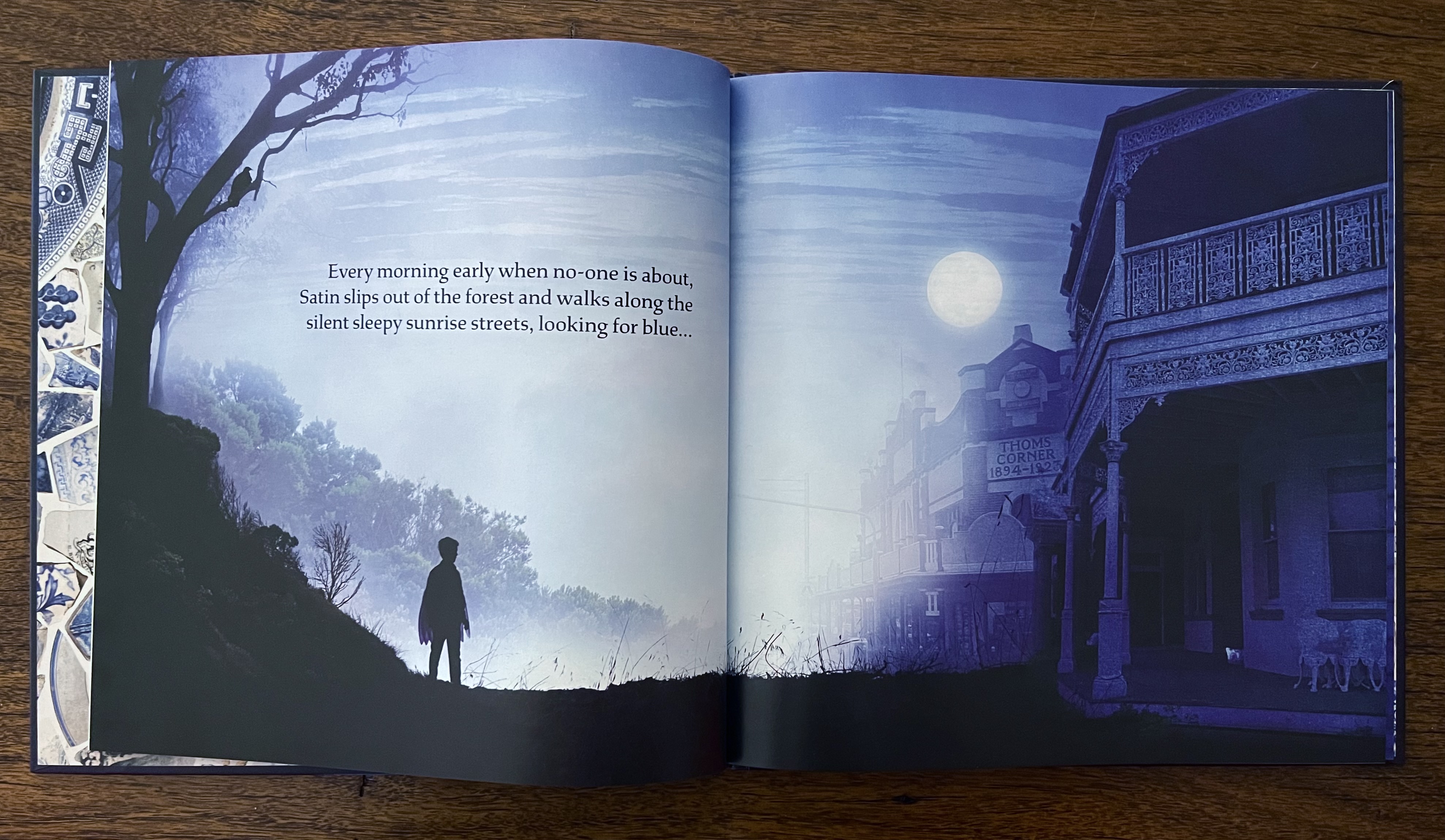
When Sophie asked if I was interested in working on Satin with her, she had barely finished her sentence before I said yes! I love working with her, and the story sounded so beautiful and intriguing. I also immediately had wonderful visions of all that blue… And it perfectly combined two things I’d worked with before. Some of my earliest montage work included shards of willow pattern plates, and I had also been doing a lot of work with cyanotypes, an early photographic process that has the most glorious blue emulsion. And the fact that Satin gathers objects to create his beautiful thing is exactly how I work too! It was perfect.
These are the first sample images I made for Satin, which we sent as part of our book proposal to the wonderful Anna at MidnightSun. They remain essentially unchanged in the final book, though you maybe be able to spot a few differences in the versions of the first image. As you can see, they are built up with layers of photographic images: the buildings, the silhouetted foreground landscape and figure, the bird, distant trees and the full moon against the misty sky… The pair underneath are more painterly. The elements are still photographic, but they are layered over a rich wash of painted cyanotype, giving a textured deep blue.
And here they are in the book:
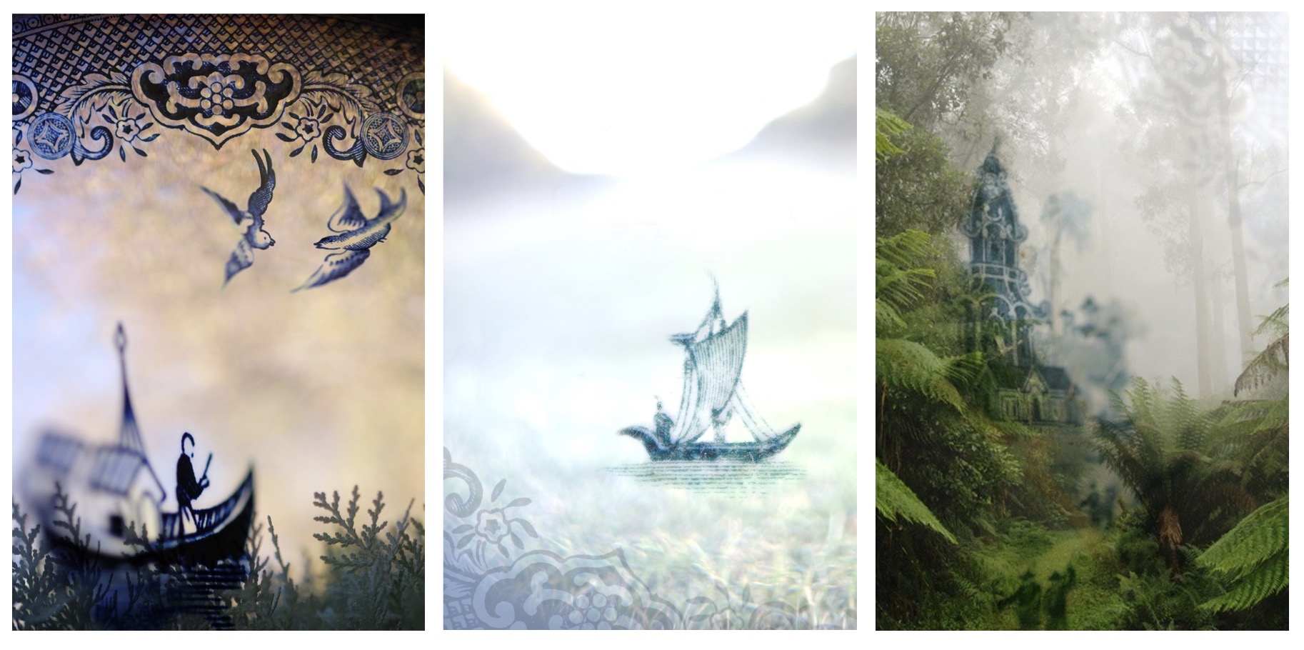
You’ll find many shards of blue china in Satin, many featuring the famous Willow pattern. Some of my earliest montage artworks were based around that same pattern. The images were made from shards of china I found in my backyard and the local landscape, and the landscapes themselves. Creating the illustrations for Satin felt like a delightful full-circle return to my early work. Here are three examples from around 2009.
The other slightly different element I’ve introduced to these illustrations, are splashes of painterly blue. The ‘paint’ is actually created with cyanotype chemistry, which is painted onto paper, and them exposed in the sun to create a rich blue. It’s wonderful cross between painting and photography, and lets you combine the two in wonderful ways. On this illustration spread, I’ve painted the splotches of blue, and digitally inserted the photographic elements.
I felt such an immediate affinity for Satin. He explores his surroundings, looking for interesting things, so that he can make something beautiful, which is exactly how I work, and Sophie’s extraordinarily beautiful prose made Satin such a pleasure to work on. I really hope you find inspiration and beauty in it too.
There’s a lovely first review of Magical Tales from French Camelot, by the fantastic book blogger Ashleigh Meikle, on The Book Muse.
Here’s a couple of bits from the review:
Sophie’s retellings are lyrical and emotive, and as she explains in her rationale at the end of each tale, she chose the most powerful moments in each tale to retell, leaving off where she needed to, and at times, explaining the rest of the story and its context within the French canon as well as its relationship to the British stories. Doing this gave an extra layer to the book, and it is the same process Kate Forsyth uses for her Long Lost Fairytales collections as well. In giving readers a history of the tale and letting us know what they have done, Sophie, like Kate, invites us into her world and writing process….
These stories bring part of the Arthurian legends and myth cycle to life for adult and young adult readers, and I loved reading them, loved feeling like I was part of the world that they came from, and loved the beautiful illustrations by Lorena, created with many different aspects digitally to tell the stories just as much as the words did. I find it hard to put her illustrations into words because I think they are the kind of illustrations you have to experience for yourself – they’re just that magical!
Exciting news! The wonderful illustrator Lorena Carrington and I have established Pardalote Press, a tiny Press making small surprising things. We’ve launched a crowdfunding campaign this morning to support our first two projects, Bird’s Eye View and Wayfarer. Bird’s Eye View is a chapbook of words—poetry and prose—and black and white images, which together form glimpses into the world of birds, and the world as seen by birds. Wayfarer is a unique set of sixteen beautiful full colour cards which in words and pictures take you on a journey of mystery, magic and meaning.
You can learn more about the Press and our first two projects on our website, and social media: Facebook and Instagram. There’s also a great little news item about it at Books+Publishing. And here below are a few words from Lorena and I, extracted from that article, as to why we started Pardalote Press:
It was in fact a mock medieval bestiary—published as an appendix to our joint book Magical Tales from French Camelot—which first made us think of the idea of working on unusual little projects. We started with the idea of Bird’s Eye View, and then, later, came the idea for Wayfarer.
We knew these were a bit too left-field to fit into mainstream publishing lists, so decided to create our own tiny press to produce them and other things we might come up with.
So–do check us out, have a look, and if you are interested, we would be very grateful for your support in the launch of this tiny press making small surprising things to help the imagination take flight!
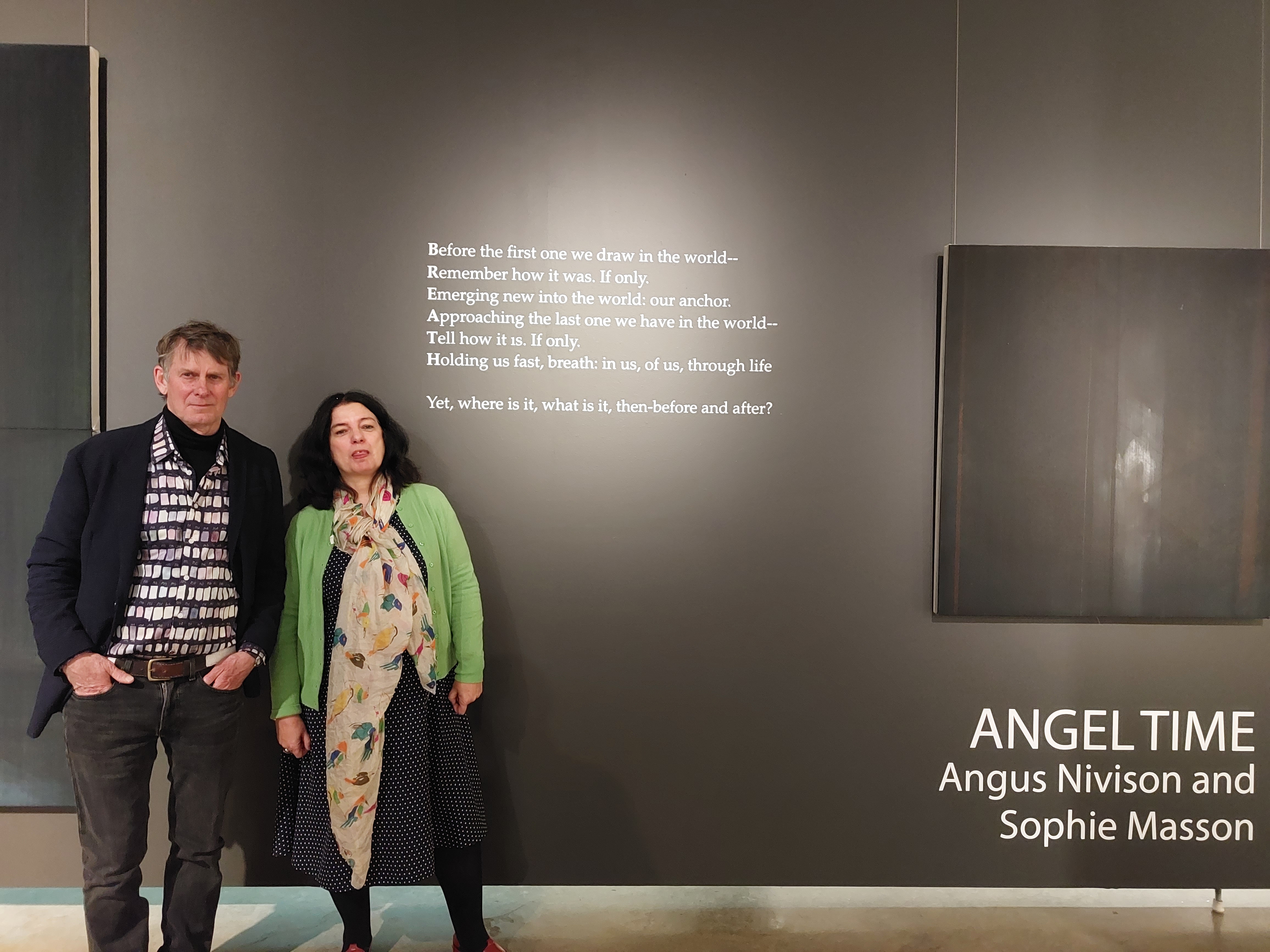
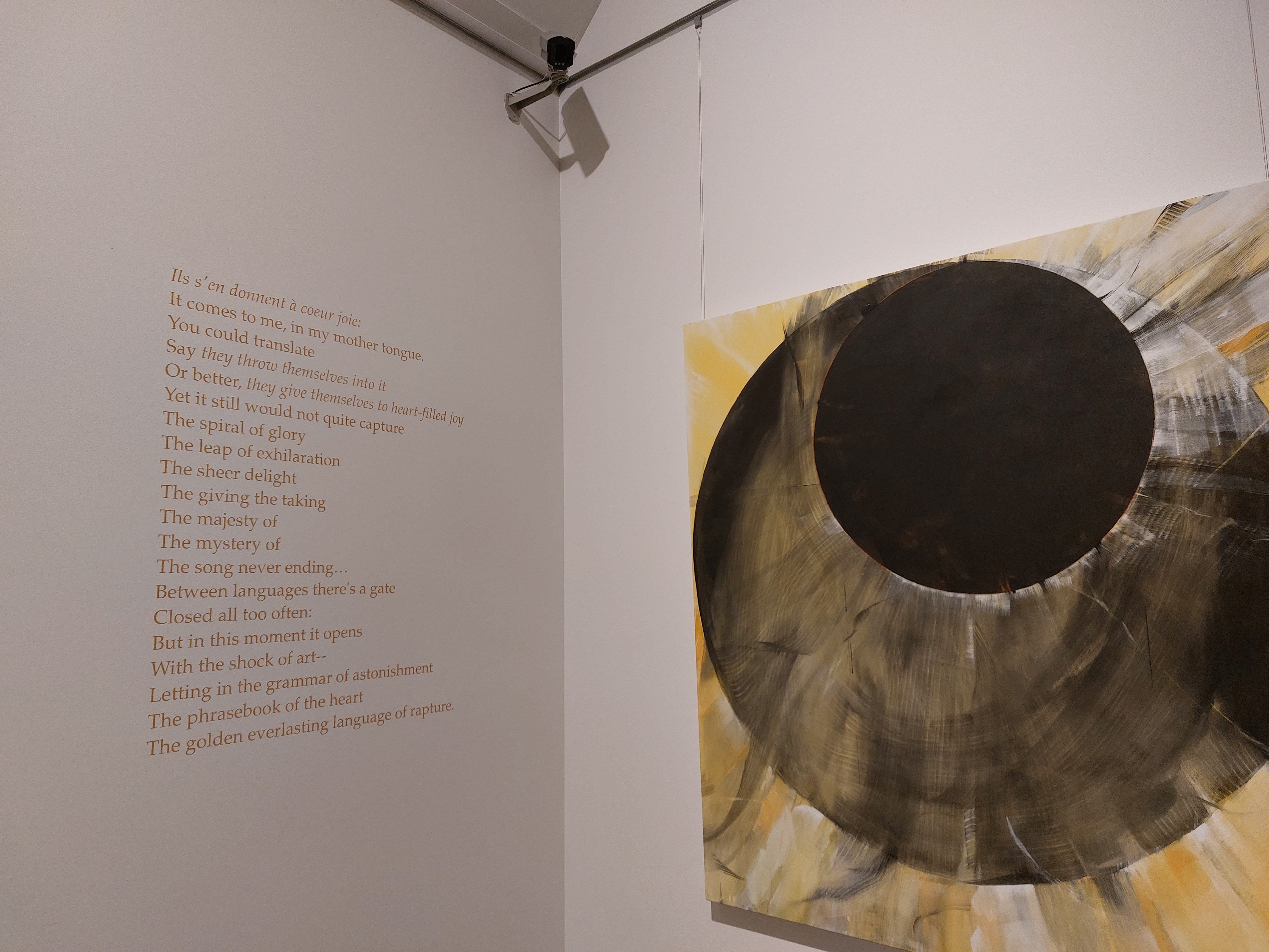
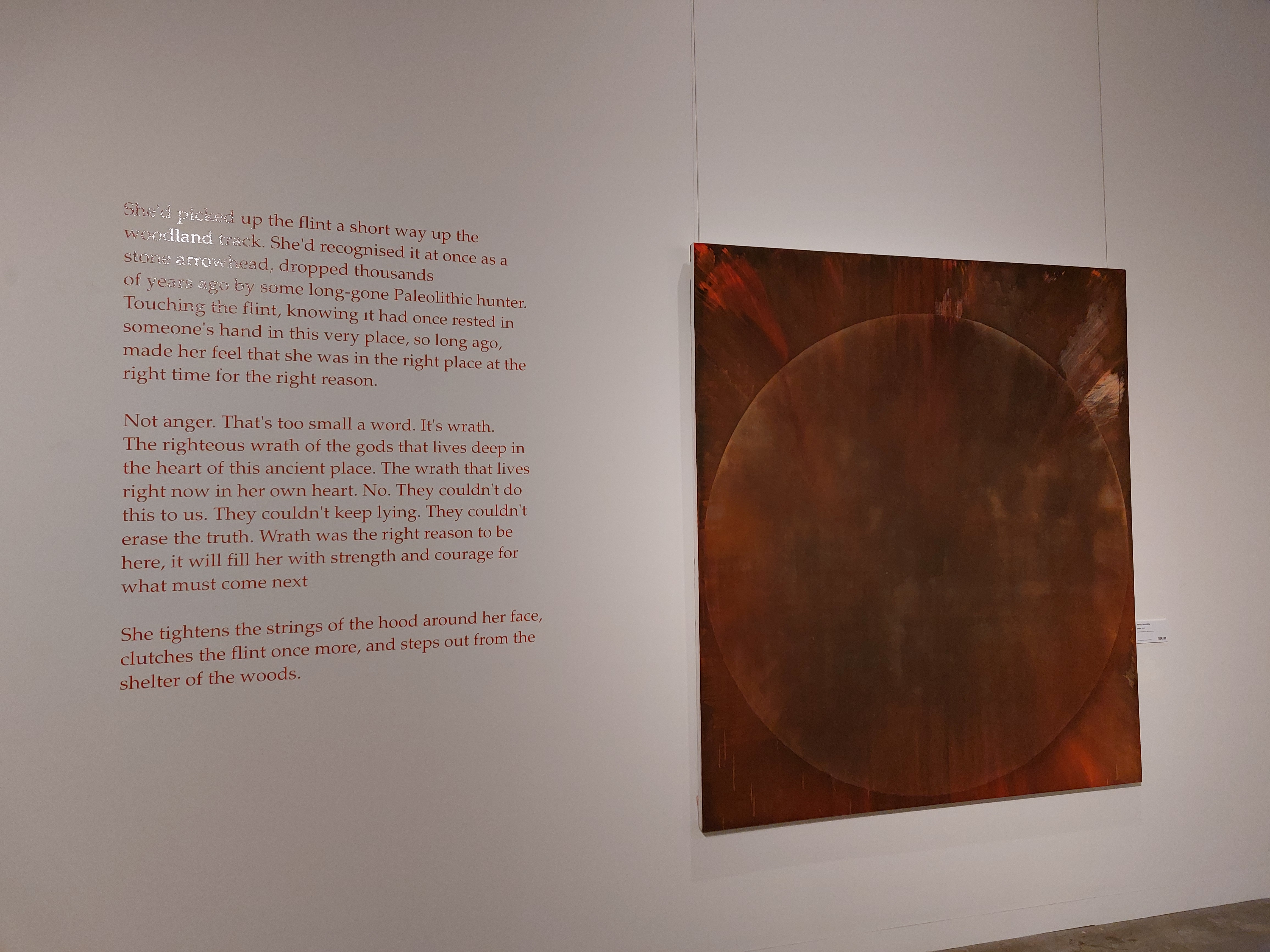
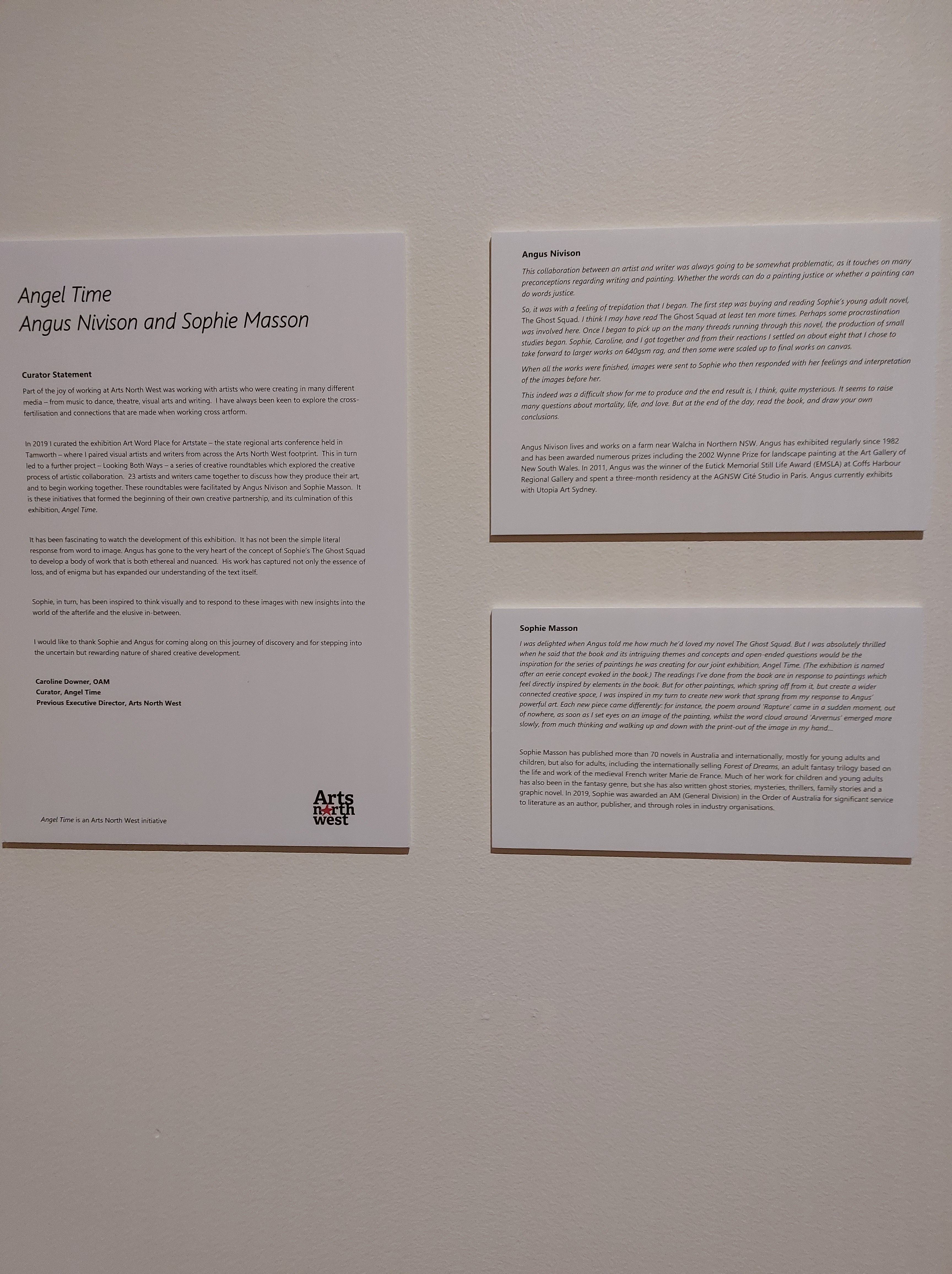
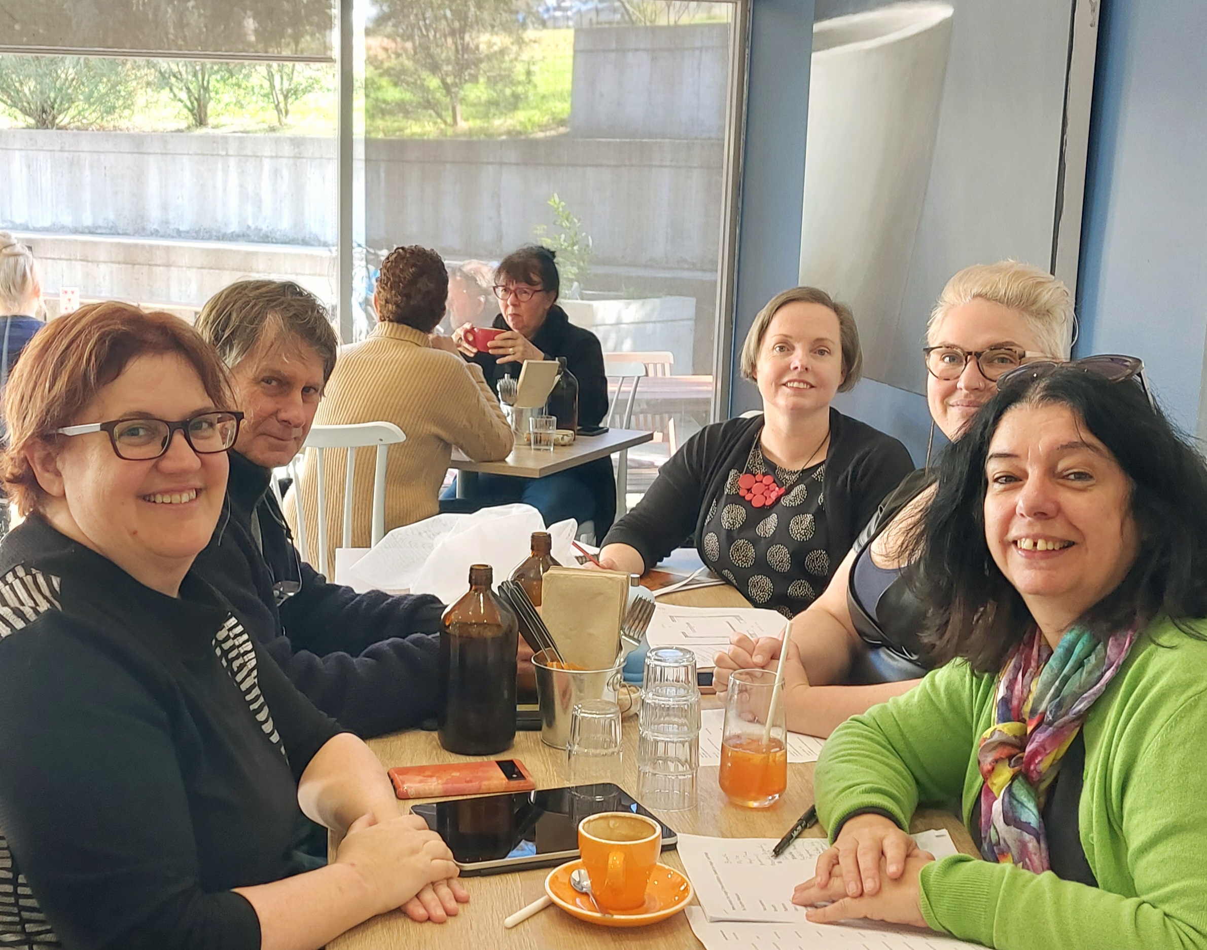
Last night was the opening of my Angel Time exhibition with the wonderful painter Angus Nivison, at the New England Regional Art Museum in Armidale. It was so exciting to see it up: it looks absolutely wonderful, so gorgeously and imaginatively displayed, immersive and extraordinary, my words and Angus’ striking, haunting artworks flowing in and out of each other beautifully. As well as my poems, song lyrics and prose fragment displayed on the walls next to the paintings they are inspired by, there are several audio readings, accessible via QR codes, of extracts from my novel The Ghost Squadwhich directly inspired others of Angus’ paintings, and also a ‘word cloud’ which is projected onto translucent hangings: looks so spookily effective! There was a big, interested crowd present and lots of great comments–people were really intrigued by it. The exhibition is on till August 28, so lots of opportunities for people to see it! Below are some pics from the exhibition.
This was an absolutely fantastic creative collaboration, the whole way through, and I am so grateful to Caroline Downer and Arts North West for initiating it, and to Rachael Parsons, Belinda Hungerford and the whole NERAM team for showcasing it so magnificently. And of course, the very warmest of thanks to my co-creator, Angus Nivison, who’s not only a most extraordinary artist, but also a lovely, generous human being and a real pleasure to work with!
At the opening of the exhibition:the poem on the wall is inspired by ‘Breath’, the painting just above the title of the exhibition.‘Rapture’: the painting and the poem associated with it.The ‘word cloud’ around the painting ‘Arvernus’ Prose fragment, inspired by the painting ‘Wrath’‘Forever Never’ song lyrics inspired by the painting ‘Endless Never’The painting ‘Surfacing, based on a scene and themes from The Ghost Squad (has audio reading associated with it)Introduction to the exhibition by curator Caroline Downer and our artist statements.And the book that inspired Angus!
Today I met with the wonderful locally-based painter Angus Nivison, as well as Arts North West director Caroline Downer, New England Regional Art Museum Director Rachael Parsons and NERAM exhibition director Belinda Hungerford, to plan the final stages for a wonderful collaborative exhibition that Angus and I are creating. Called Angel Time, it will open on July 1 at NERAM and will go till August 28. It is something that grew out of an Arts North West workshop last year called Looking Both Ways, where artists and writers were paired together to create joint works. Angus and I led that workshop and part of it was that he and I would then create works for an exhibition this year. Angus had recently read my book The Ghost Squad and to my delight he loved it so much that he decided to use it as the basis for a series of paintings, based on certain elements of the book and its themes and allusions. Then, based on my seeing these paintings, in my turn I created some new pieces for several of his artworks: poems, prose, song lyrics and more…As well, for several of the paintings directly inspired by incidents or moments in the book, I’ve recorded short readings from The Ghost Squad.
It’s been such an inspiring and exciting process–and today, with both painting and word-based works created, it was all at the stage where we could sit down with the NERAM directors and talk about how it will all be shown in the physical space of the gallery. It’s going to be just amazing, I can’t wait!
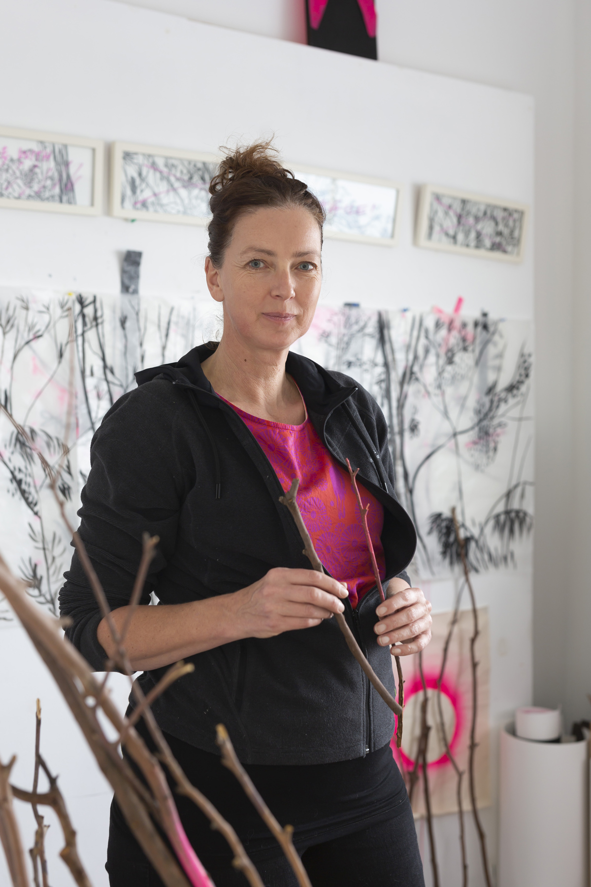
Artist and designer Bettina Kaiser created the beautiful cover for A Hundred Words for Butterfly. Today I’m delighted to welcome her to my blog for a behind-the-scenes interview.
Bettina, tell us about your process in creating the cover for A Hundred Words for Butterfly. What preparations did you have to make? What stages did the work go through? What inspired you? And what materials/media did you use?
I really enjoyed reading your book. Currently we are in COVID lockdown, and so the timing was perfect to let myself be transported to Basque country through the story. As I was reading it, I was also researching the places online: Saint-Jean-Pied-de-Port, a beautiful little town and the place where most of the story takes place. The Camino de Santiago and the rolling hills and picturesque Basque countryside it covers. I then allowed myself to get lost a little in Basque traditions. The colours of the houses and window frames, the tricoloured flag, the beret, incredibly delicious looking food.
I empathised with all three characters in the story as well: Alex walking the trail (I love walking), Helen being the illustrator and loving to draw (a fellow artist), and Tony researching his family (an interest I share).
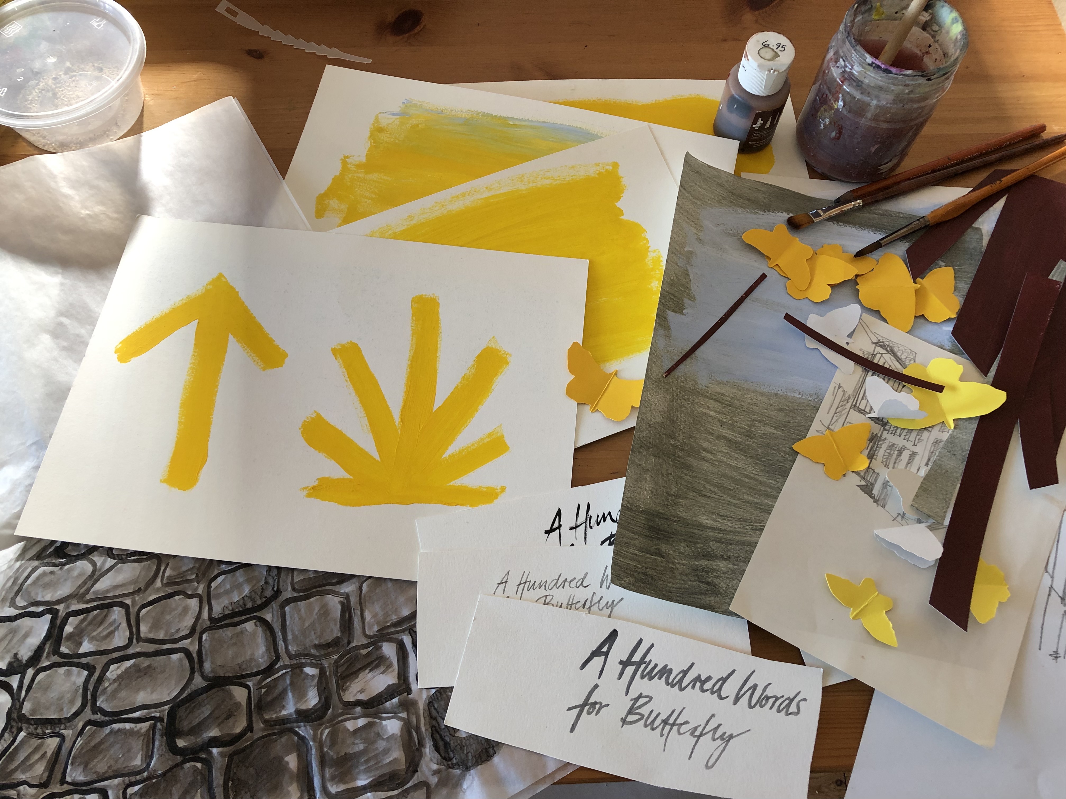
From there I had a few creative ideas of what the cover could look like. Conceptually, they were based on elements in the story that I found significant: the cobblestone streets, the wayfinding symbols of the Camino, Basque colours and symbols, but also the family photos that you sent me and the more recent photos from your visit there.
The art materials I used were just what I had on hand in the studio: acrylic paint, ink, gouache, paper scraps. From there I put together a few layouts to explore three main concepts: picking up the title, the butterflies, and doing a flat lay with other aspects of the interwoven stories, the cobblestones causing Helen’s fall but also representing the path, the Camino, and the twin sisters, one staying inside watching through the window, the other walking on a path.
What were the challenges? And the pleasures?
As with any book cover, my aim is to capture the essence of the book. I always also need to know that you, the author, are 100% behind it. At the end of the day, it is their book, your book, and I would not want to force the cover design “onto” it or indulge in some design folly that is just exciting for me as an artwork on its own. It needs to fit. But it took me a while to find what the essence is for me in your story.
What has now become the cover was pretty early on my favourite, and the more I tried to work on alternative ideas, the more I was drawn back to the actual artwork that we chose. I re-read passages of the book and realised how the stories of the three characters are so intertwined, and also link each character’s past, present and future. The other (unfinished) artwork concepts simply felt too one-dimensional. In my head I even likened this to one of those pinboards in a murder investigation with all the suspects, witnesses, and places, and the threads joining them. That was what I wanted to have the artwork reflect: old and new stories spanning continents. Stories that touched, overlapped, merged.
Then came a tricky point in the process where I was really loving that idea and artwork (which is almost exactly what we have now), but I laboured over other concepts, as I did not want to present you with just one option in a kind of take it or leave it way. But I really felt strongly about the concept and liked it visually too. So, after a few days of mulling it over, I decided that I will show you this artwork and explain with some images and words the ideas/concepts for alternative covers to see what you think. Well, it sure was nice when you concurred, and only a few hours later your very enthusiastic “YES! This is it!” came back.
Your novella was perfect for my lockdown escapism. I really enjoyed allowing myself to mentally wander into the ancient streets of Saint-Jean-Pied-de-Port, to dream of faraway places, and to find out more about the Camino and Basque culture. It lifted me up and touched so many interests of mine though the different characters. I really very much enjoyed the video chat we had initially, and you telling me about your Basque family connections and getting to know you.
What do you, as both a designer and a reader, see as the most important things for authors and publishers to consider, when it comes to commissioning book covers?
I think authors in particular need to have a lot of trust to put their work, which they have laboured over for so long, and that often is so personal, into an artist’s hand to create the cover. I encourage authors and publishers to look at previous artwork that a prospective book cover designer has created (a good start is our industry organisation Australian Book Designer Association’s directory) and see if they like the general style and design approach.
While the publisher needs to keep their eye on a certain overarching style and standard for their publications, I personally do love that I can more often than not work directly with “my authors”, get to know them and get them to tell me what their work is about, what matters and where their focus is.
As in many things in life, trust and mutual appreciation is key. Many publishers work with a regular stable of illustrators and designers whom they entrust their publications to. I have been lucky to have worked with Bronwyn Mehan and Spineless Wonders on so many projects over the past decade and to have been given a lot of creative freedom. Plus, I am very happy to have often worked directly with the authors.
My pet hates are design for design’s sake (the self-indulgent kind), style trends in book covers. So, dear publishers and authors, I’d say watch out for that!
Does creating a cover for an audio book differ from that for a print or ebook? If so, in what way?
The short answer is no. It is just a different shape, and many projects that I work on need the artwork to be converted into all kinds of formats, ranging from eBook covers to website banners and more. So it is a style, a materiality and elements that you design, and then it is rolled out to different media. In fact, your story, whilst first published as an audio book (I love that format by the way), will also be available now as an eBook by Spineless Wonders.
You work in a number of art and design fields aside from books. Tell us about some of the other things you do.
I consider myself a “Jill of many trades”.
I like the explorative, conceptual aspects of design, but I do have a lot of bread-and-butter jobs that are layouts, websites, logo designs and the like. But I am also an artist and have a separate practice in my small studio – no screens allowed there – just for my art projects. I recently had an exhibition that featured prints, mixed media works, and installations around the current climate crisis and us humans in the environment.
(Book) cover design is where I work across both disciplines. I love it. I love working with authors, I love books and stories, and I love that each one needs their unique artwork. Often I experiment with materials and collages and photos in my studio, and I sometimes do hand lettering, as I did for A Hundred Words for Butterfly. I then photograph or scan it, bring it together on screen, manipulate it if needed, mix, cut, paste, experiment, tinker with typography. It brings it all together and as I mentioned earlier, I am so grateful to be given a lot of trust and creative freedom.
My artist sister Camille Masson Talansier lives in the small town of Hasparren in the Basque country, 25 kms inland from Biarritz. In this charming video, made for the run-up to the release of my audio novel A Hundred Words for Butterfly, you get a glimpse of her life in this beautiful region, and the things that are important to her: art, food, family.
To check out more of Camille’s art, visit her Instagram page here, and website here.
Today I’m welcoming my wonderful co-creator, Lorena Carrington, to this blog, to write about the travels in France that helped to inspire her glorious illustrations in French Fairy Tales. All photographs in this post are by Lorena. French fairy tale travelling, by Lorena Carrington In late September last year, I touched down in France with […]