In this lovely post, Lorena writes about how she created the stunning visual world of the book.
When Sophie asked if I was interested in working on Satin with her, she had barely finished her sentence before I said yes! I love working with her, and the story sounded so beautiful and intriguing. I also immediately had wonderful visions of all that blue… And it perfectly combined two things I’d worked with before. Some of my earliest montage work included shards of willow pattern plates, and I had also been doing a lot of work with cyanotypes, an early photographic process that has the most glorious blue emulsion. And the fact that Satin gathers objects to create his beautiful thing is exactly how I work too! It was perfect.
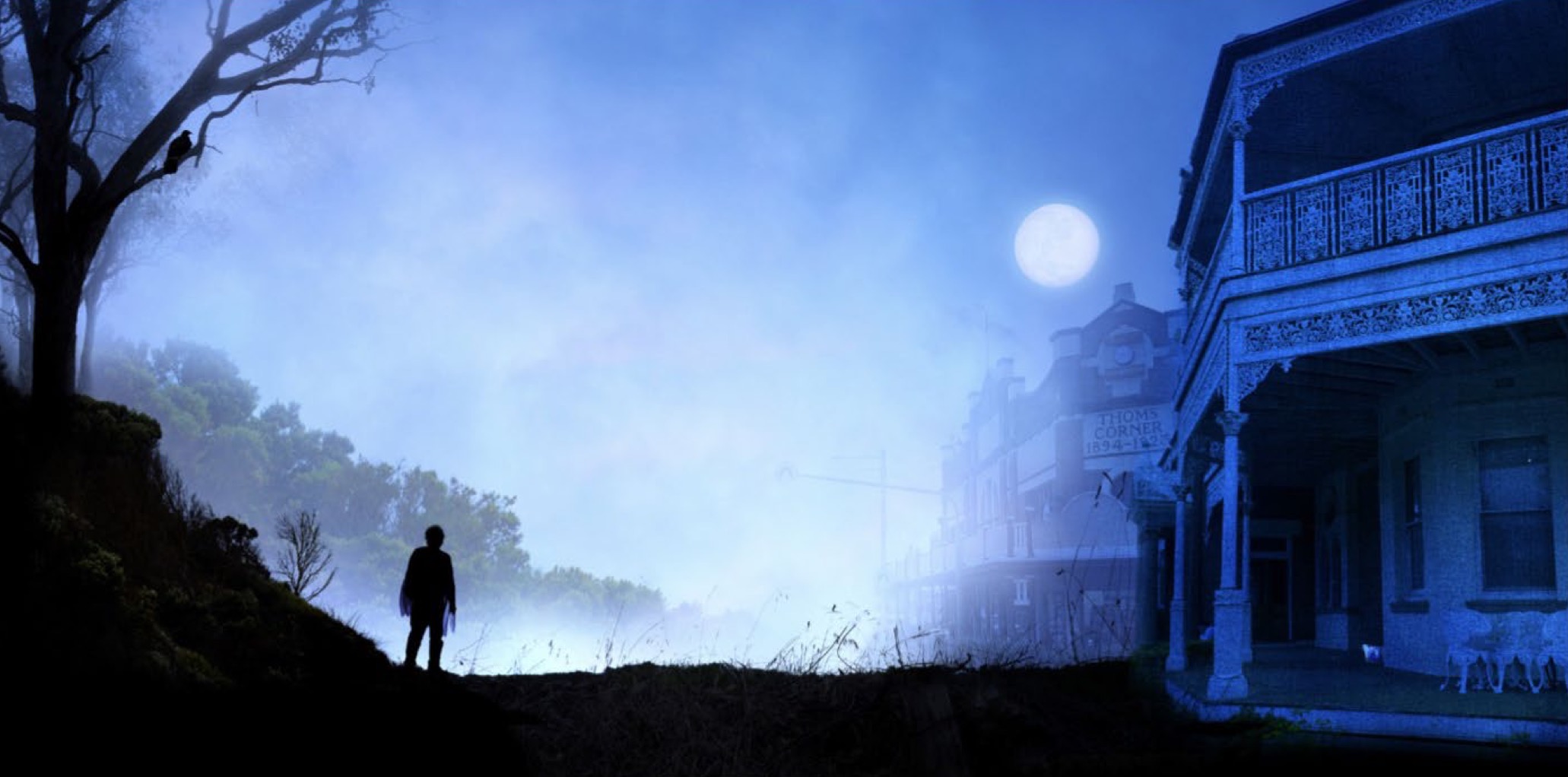
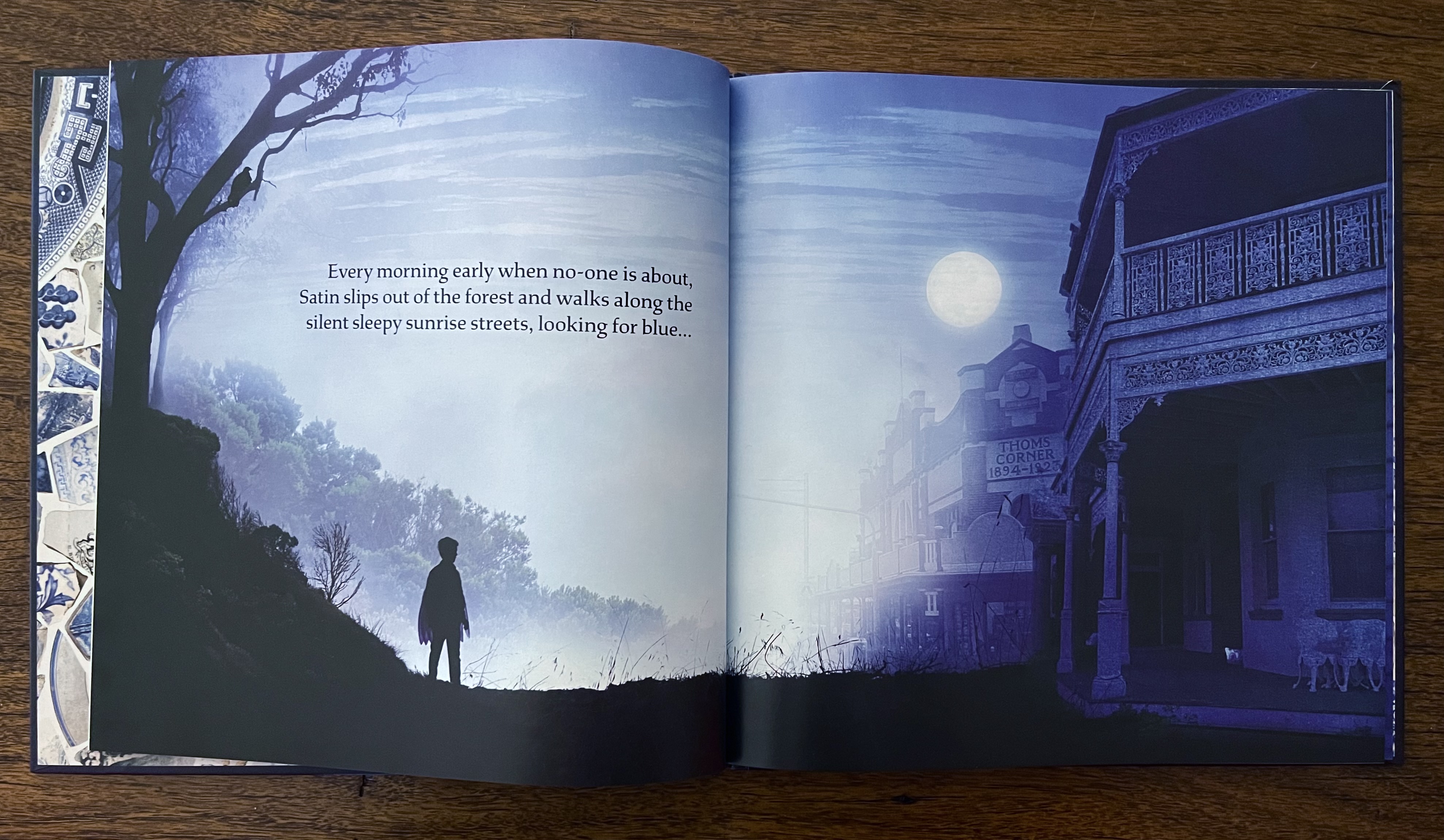
These are the first sample images I made for Satin, which we sent as part of our book proposal to the wonderful Anna at MidnightSun. They remain essentially unchanged in the final book, though you maybe be able to spot a few differences in the versions of the first image. As you can see, they are built up with layers of photographic images: the buildings, the silhouetted foreground landscape and figure, the bird, distant trees and the full moon against the misty sky… The pair underneath are more painterly. The elements are still photographic, but they are layered over a rich wash of painted cyanotype, giving a textured deep blue.

And here they are in the book:

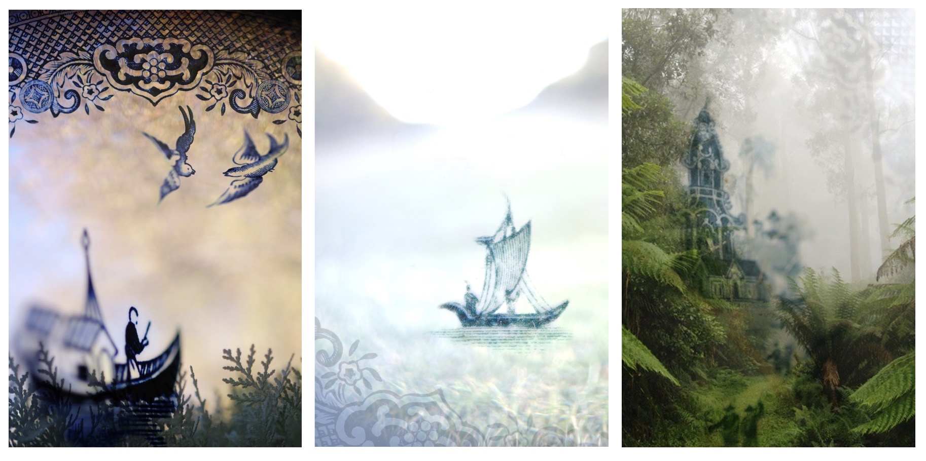
You’ll find many shards of blue china in Satin, many featuring the famous Willow pattern. Some of my earliest montage artworks were based around that same pattern. The images were made from shards of china I found in my backyard and the local landscape, and the landscapes themselves. Creating the illustrations for Satin felt like a delightful full-circle return to my early work. Here are three examples from around 2009.
The other slightly different element I’ve introduced to these illustrations, are splashes of painterly blue. The ‘paint’ is actually created with cyanotype chemistry, which is painted onto paper, and them exposed in the sun to create a rich blue. It’s wonderful cross between painting and photography, and lets you combine the two in wonderful ways. On this illustration spread, I’ve painted the splotches of blue, and digitally inserted the photographic elements.

I felt such an immediate affinity for Satin. He explores his surroundings, looking for interesting things, so that he can make something beautiful, which is exactly how I work, and Sophie’s extraordinarily beautiful prose made Satin such a pleasure to work on. I really hope you find inspiration and beauty in it too.
