Artist and designer Bettina Kaiser created the beautiful cover for A Hundred Words for Butterfly. Today I’m delighted to welcome her to my blog for a behind-the-scenes interview.
Bettina, tell us about your process in creating the cover for A Hundred Words for Butterfly. What preparations did you have to make? What stages did the work go through? What inspired you? And what materials/media did you use?
I really enjoyed reading your book. Currently we are in COVID lockdown, and so the timing was perfect to let myself be transported to Basque country through the story. As I was reading it, I was also researching the places online: Saint-Jean-Pied-de-Port, a beautiful little town and the place where most of the story takes place. The Camino de Santiago and the rolling hills and picturesque Basque countryside it covers. I then allowed myself to get lost a little in Basque traditions. The colours of the houses and window frames, the tricoloured flag, the beret, incredibly delicious looking food.
I empathised with all three characters in the story as well: Alex walking the trail (I love walking), Helen being the illustrator and loving to draw (a fellow artist), and Tony researching his family (an interest I share).
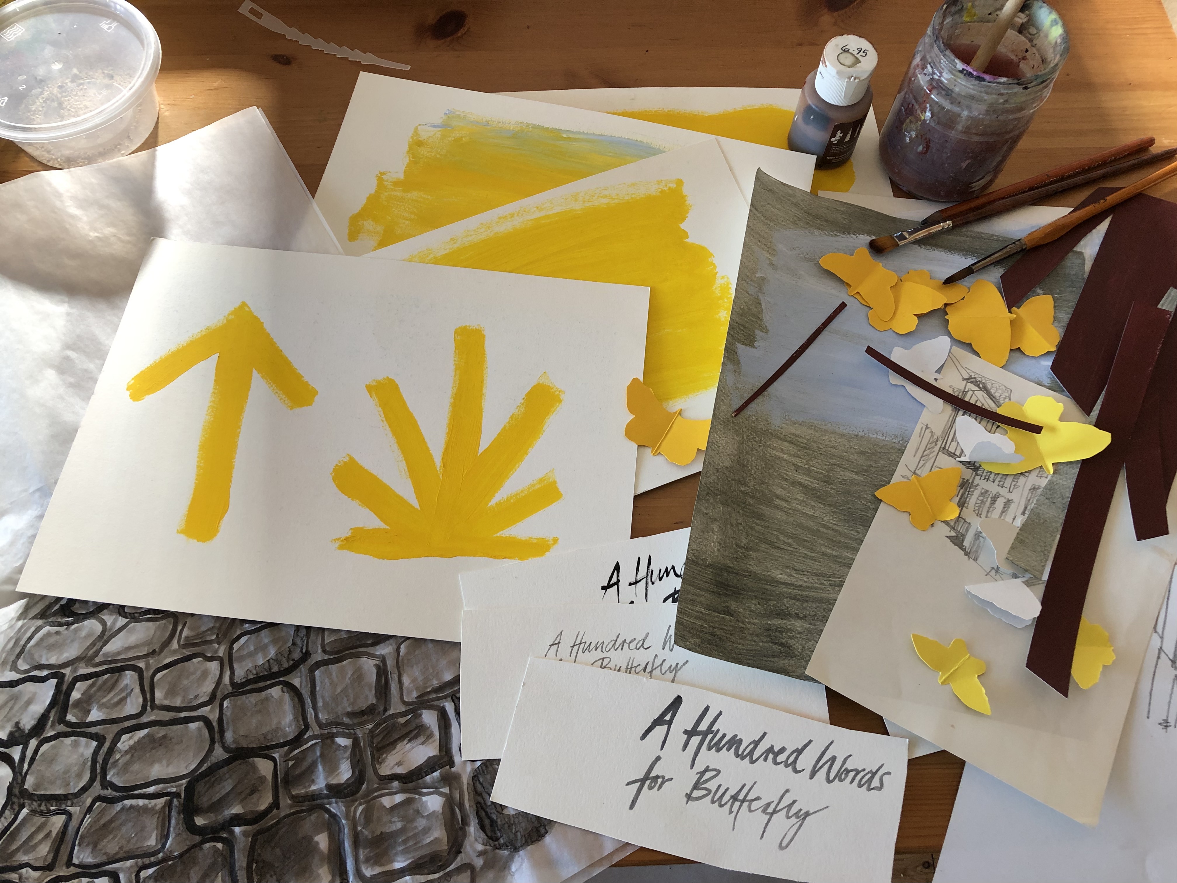
From there I had a few creative ideas of what the cover could look like. Conceptually, they were based on elements in the story that I found significant: the cobblestone streets, the wayfinding symbols of the Camino, Basque colours and symbols, but also the family photos that you sent me and the more recent photos from your visit there.
The art materials I used were just what I had on hand in the studio: acrylic paint, ink, gouache, paper scraps. From there I put together a few layouts to explore three main concepts: picking up the title, the butterflies, and doing a flat lay with other aspects of the interwoven stories, the cobblestones causing Helen’s fall but also representing the path, the Camino, and the twin sisters, one staying inside watching through the window, the other walking on a path.
What were the challenges? And the pleasures?
As with any book cover, my aim is to capture the essence of the book. I always also need to know that you, the author, are 100% behind it. At the end of the day, it is their book, your book, and I would not want to force the cover design “onto” it or indulge in some design folly that is just exciting for me as an artwork on its own. It needs to fit. But it took me a while to find what the essence is for me in your story.
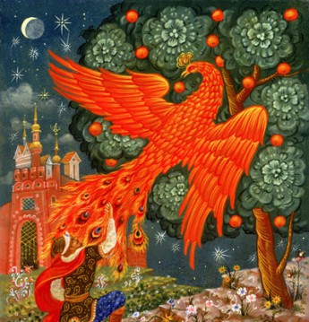
What has now become the cover was pretty early on my favourite, and the more I tried to work on alternative ideas, the more I was drawn back to the actual artwork that we chose. I re-read passages of the book and realised how the stories of the three characters are so intertwined, and also link each character’s past, present and future. The other (unfinished) artwork concepts simply felt too one-dimensional. In my head I even likened this to one of those pinboards in a murder investigation with all the suspects, witnesses, and places, and the threads joining them. That was what I wanted to have the artwork reflect: old and new stories spanning continents. Stories that touched, overlapped, merged.
Then came a tricky point in the process where I was really loving that idea and artwork (which is almost exactly what we have now), but I laboured over other concepts, as I did not want to present you with just one option in a kind of take it or leave it way. But I really felt strongly about the concept and liked it visually too. So, after a few days of mulling it over, I decided that I will show you this artwork and explain with some images and words the ideas/concepts for alternative covers to see what you think. Well, it sure was nice when you concurred, and only a few hours later your very enthusiastic “YES! This is it!” came back.
Your novella was perfect for my lockdown escapism. I really enjoyed allowing myself to mentally wander into the ancient streets of Saint-Jean-Pied-de-Port, to dream of faraway places, and to find out more about the Camino and Basque culture. It lifted me up and touched so many interests of mine though the different characters. I really very much enjoyed the video chat we had initially, and you telling me about your Basque family connections and getting to know you.
What do you, as both a designer and a reader, see as the most important things for authors and publishers to consider, when it comes to commissioning book covers?
I think authors in particular need to have a lot of trust to put their work, which they have laboured over for so long, and that often is so personal, into an artist’s hand to create the cover. I encourage authors and publishers to look at previous artwork that a prospective book cover designer has created (a good start is our industry organisation Australian Book Designer Association’s directory) and see if they like the general style and design approach.
While the publisher needs to keep their eye on a certain overarching style and standard for their publications, I personally do love that I can more often than not work directly with “my authors”, get to know them and get them to tell me what their work is about, what matters and where their focus is.
As in many things in life, trust and mutual appreciation is key. Many publishers work with a regular stable of illustrators and designers whom they entrust their publications to. I have been lucky to have worked with Bronwyn Mehan and Spineless Wonders on so many projects over the past decade and to have been given a lot of creative freedom. Plus, I am very happy to have often worked directly with the authors.
My pet hates are design for design’s sake (the self-indulgent kind), style trends in book covers. So, dear publishers and authors, I’d say watch out for that!
Does creating a cover for an audio book differ from that for a print or ebook? If so, in what way?
The short answer is no. It is just a different shape, and many projects that I work on need the artwork to be converted into all kinds of formats, ranging from eBook covers to website banners and more. So it is a style, a materiality and elements that you design, and then it is rolled out to different media. In fact, your story, whilst first published as an audio book (I love that format by the way), will also be available now as an eBook by Spineless Wonders.
You work in a number of art and design fields aside from books. Tell us about some of the other things you do.
I consider myself a “Jill of many trades”.
I like the explorative, conceptual aspects of design, but I do have a lot of bread-and-butter jobs that are layouts, websites, logo designs and the like. But I am also an artist and have a separate practice in my small studio – no screens allowed there – just for my art projects. I recently had an exhibition that featured prints, mixed media works, and installations around the current climate crisis and us humans in the environment.
(Book) cover design is where I work across both disciplines. I love it. I love working with authors, I love books and stories, and I love that each one needs their unique artwork. Often I experiment with materials and collages and photos in my studio, and I sometimes do hand lettering, as I did for A Hundred Words for Butterfly. I then photograph or scan it, bring it together on screen, manipulate it if needed, mix, cut, paste, experiment, tinker with typography. It brings it all together and as I mentioned earlier, I am so grateful to be given a lot of trust and creative freedom.
Websites:
design = www.bkad.com.au
art = www.bettinakaiser.com
