 I’ve known the extraordinarily talented young creator Leon Coward since he was a pre-teen reader/reviewer flatteringly enthusiastic about my books. Today, Leon’s love of creating art has led him to work in many different fields–not only literature, but music, visual arts, and now film-making. Involved first as a concept artist for the short film 2BR02B–To Be or Naught to Be, a dystopian work based on one of Kurt Vonnegut’s short stories, Leon went on to take a much greater part in the creation of the film.
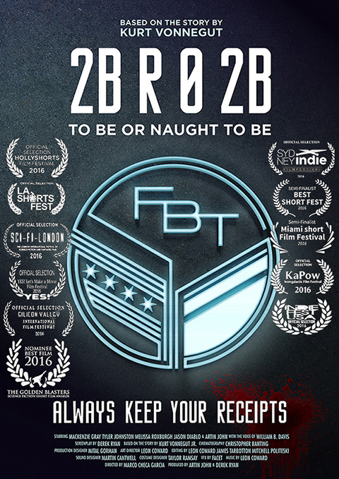
The Canadian production, which has already been selected for no less than 15 prestigious short film festivals, has its Australian premiere today, in Sydney. To mark this exciting occasion, I talked with Leon about the creative journey behind the film.
Leon, how did you become involved in the creation of 2BR02B: To be or Naught to Be?
My background is in graphic design and traditional illustration. The producer Artin John is a childhood friend, and he began co-producing the film and asked for me to create a poster… then concept art… then the mural and other artwork. I had no idea how involved I would later become.
The film is based on a Kurt Vonnegut short story which imagines a dystopian world in which babies are only allowed to be born if another life is terminated. What were the particular challenges involved in adapting the story for film?
The tone was a challenge. It’s easy to show too little or be too graphic, be too nonchalant or be too sombre. You can try to be as true to Vonnegut’s material as possible, but at the end of the day also you’re working with the material that you as a team have generated, not just Vonnegut’s, and that’s what you’ve got to make work. There were a few things from the original story that confused our test audiences – in one instance it was putting jazz at the end of the film, and Vonnegut gets away with it because as a reader you don’t hear it, but we realised it just sounded like cinema lounge music and it spoiled the audience’s mulling over of events.
 2BR02B has an ensemble cast, so an editing challenge was working out the balance between them. We’d all thought the film would centre on Wehling and his internal conflict, because his dilemma motivates his actions which affect the other characters – the problem was that while we knew what he was thinking and what he’s gearing himself up to do, the audience didn’t. The first edit was melodramatic simply because the audience was asked to feel for a character they didn’t know. So I shook things up and this was hard because I took an edit to the team and, although the story itself hadn’t changed, what was emphasized had changed. For a long time we were also going for an emotional ending, but after test screenings it was clear the audience were frustrated. My grandmother suggested a twist, and I incorporated it and showed the team without warning them – that way they got to experience it as the audience would.
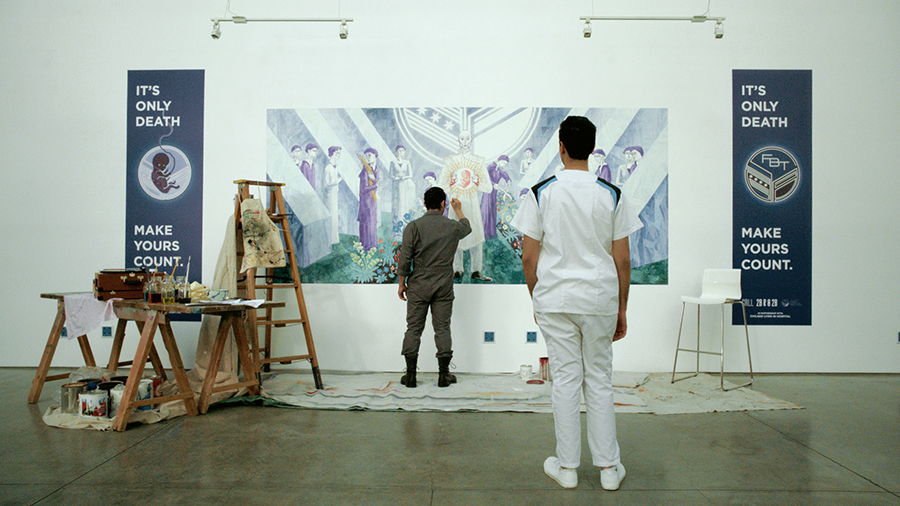
My own big challenges were creating the fictitious ‘Federal Bureau of Termination’ set in Chicago and the Painter’s 16-ft mural. The FBT is represented by Leora, a gas chamber hostess – but other than her and a brief shot of a gas chamber, the FBT doesn’t appear. So to convey the fact that this organization dominated the society, we gave them a brand identity that pervaded everything – corporate signage, posters, banners, badges, tags, earpieces and costume motifs. Vonnegut described a symbolic design for their logo (an ‘eagle perched on a turnstile’), but I approached it as a new branding commission and researched federal seals and local symbols for Chicago. There are a lot of references – the stars and stripes on the US and Chicago flags, the Chicago municipal device (which is a Y for their shaped river), even the wings of their state insect the Monarch butterfly. But there are also a lot of differences to real seals which make it very impersonal, very geometric, skeletal & circuit-like, and no natural symbols.
The mural took 6 months to design and finish. It was digitally painted in Sydney, then printed in Canada. All the characters discuss its symbolism and pose for it – if the mural didn’t come across as a genuine work of art, it’d devalue the acting. Its design was driven by story needs and Vonnegut’s prose. It shows a false utopian garden where nurses and FBT staff, dressed in white and purple, symbolically turn soil, plant seeds, and control life and death. Purple is traditional for sacrificial robes, and Dr. Hitz, who is the architect of population control, is painted as a ‘Zeus-like’ figure. The mural had to be recognizably propaganda and contemporary, so our director Marco instructed me to look at Russian war posters, Art Deco and Cubism. At the same time, I knew the mural had to have religious overtones. I’d experimented with a mix of Expressionism and William Blake-esque styles – trying to avoid the ‘communist cornfield worker’ interpretations I’ve seen in student versions of the film, or any specific garden-type, but I was going too far in that direction. My new layout was Art Deco-inspired, using diagonals and circles – essentially it’s an ‘X’ drawing your eyes to Hitz, and the FBT logo acts like a sun, framing Hitz’s head like a halo. I blended Cubism, Futurism and Brutalism with religious styles. The concrete flats, which also mimic the FBT logo, overpower the barest of gardens and help narrow the viewer’s focus, and the floating flower made it futuristic. The style of plants and their millefleur treatment came from The Lady and the Unicorn tapestry and the religiously-themed The Hunt of the Unicorn tapestry. Sir Edward Burne-Jones’ pilgrimage paintings, and especially his Wedding of Psyche, provided the inspiration for the figures, their poses, compositional distribution and costumes (I also referenced medical scrubs). Hitz needed a recognizable inference of himself as a messiah – so Byzantine iconography provided the inspiration for his hands (which are Christ’s) and the haloed foetus, as well as the mural’s forced perspective. For Hitz’s costume there was also a bit of SS uniform and Nehru jacket, dentist and Jedi, and a more contemporary influence from Gehn in Cyan’s Riven, a character who also sees himself as a god. Everywhere you look the message is there, and it was hard to make the mural function as a finished work of art yet still be visibly ‘in-progress’. The aim was to show a society where there is no respect for religious heritage – God is dead, and the FBT is filling the vacancy – and the mural needed to be created that way. It took months of digitally painting and scanning paint textures and brushstrokes, since the mural had to withstand close-ups. Halfway through, Paul Giamatti had scheduling conflicts, and I had to repaint the face for our Hitz replacement, Mackenzie Gray. The mural was printed in strips of paper which overlapped; clear hard-drying gel was applied to give it a texture, and Ferrero-Rocher wrappers (which have a great canvas texture) were used for the gold highlights.
The project was an international collaboration over 3 years between crew in Australia, Canada, UK, Mexico and the Netherlands. What were the challenges and advantages involved in such a big undertaking over such distances and different time zones? What did you learn from the experience?
We had cast and crew in Vancouver, myself and other crew in Sydney, an artist in the Netherlands, and a VFX school in Mexico which did effects as part of their professional training. Footage was flown to me in Sydney and I began re-editing with James Tarbotton. Then Martin Cantwell, our brilliant sound designer in London, came onboard. The time differences were okay as calls were early morning or late night, so we’d avoid each others’ work hours – which was important since the film was not a paying project. The separation was a technical disadvantage, since exporting and transferring files adds a lot of time. It’s also important to be able to see, at least once, the person you’re communicating with, in person or Skype, because it makes email writing a lot easier. While there were disadvantages, I think the distance for me and my collaborators in Sydney allowed us to approach the project in a way we mightn’t have otherwise – especially in the editing, where we could respond as a fresh audience without preconceptions, or even knowing what the actors were like out of character.
You worked on many different aspects of the film, as art director, composer, film editor and associate producer. How did you navigate all these different roles? Was there one aspect you preferred above all?
 In a sense it hasn’t been hard to navigate between the roles because they were prepared for – I had this idea that the Painter would have a gramophone, and that he was listening to Schubert’s “Ave Maria”. When gun-shooting later ensues, the song could provide a macabre serenade. I stuck the gramophone in my concept art, and waited for the idea to take hold – it was influencing the film’s music to some extent without having to be the composer, but ironically I eventually found myself in the role and this wasn’t intentional! There is a some incidental music, but I pushed to have it that the only music was the ‘live’ gramophone so that the music was simply part of the world, and not an ‘invisible’ emotional narrator as film scores often are. The film and the Ave Maria recording were designed and edited around each other: while films are often edited to an existing temp track of unrelated music, this film was edited to a pre-existing recording of Ave Maria, which was later replaced with a tailor-made recording, post editing and sound design. It enabled us to go for a different interpretation too, which would greater contrast the action. We were fortunate to have my sister Imogen Coward, who is both a skilled soprano and conductor, record the version for us that appears in the finished film. We wanted to avoid any artificial stretching or splicing, so we had the unusual challenge of recording in one take, matching the timing of the temp version. We had 2 frames wriggle room, and the edit didn’t have any room to be changed for different timing. It was tiring, but it was worth it because it has a quality that is lost when music, especially singing, is heavily edited.
The film has so far received 5 nominations and 14 international festival selections, including for its Australian premiere at the Sydney Indie Film Festival on October 19. That’s quite an achievement! What do you think are the special qualities of the film which have made it attractive to festival selectors?
While Vonnegut created the story, it’s also the way the cast and crew have interpreted, realized and communicated the story. Derek Ryan, our screenwriter and co-producer, did a good job of cutting away story material that couldn’t be cinematic – so from the start we were all working with a document that concentrated our focus. 2BR02B really takes a cross-section of behaviours in a society where life and death are pushed to absurdities, but there’s no obvious political or moral position in its telling – just the drama of human action, and I think it allows the viewer in on their own terms. I think one of the things that’s helped is how the film feels when you watch it vs what is leaves you thinking about – cinematically it is very static up to a point, and then there’s this burst of drama and the music making it madness, and then just desolation, and that hits the audience. Vonnegut’s narrative was influenced by his experiences as a P.O.W. in Dresden, and even though his story is fiction, the themes are relevant and resonate because the wars have cast such a long shadow. It’s subtle in our film, but the hospital cross is actually a swastika, and the banners flanking the mural are inspired by Nazi banners – Wehling’s cry “It’s only death” was used on our banners, so instead of his line being spontaneous, it becomes him quoting propaganda which the audience saw earlier.

What’s next for you, in terms of films, after this one?
I’m independently developing my own film project – an adaptation of Oscar Wilde’s “The Happy Prince”, and am shifting between generating its music and visual material.
You are also engaged in doing a PhD on aspects of film design. Can you tell us a bit about that?
It essentially provides an analytical process which teases apart a film’s design (if it has one) – whether the story, visuals, acting, music, sound or all their combination. The method is quite straightforward, but its theoretical justification and demonstration is very demanding. The method has had encouraging support from many industry practitioners.
As a multi-talented creator and performer, you are also involved in music, visual arts and literature. Tell us about some of your projects in those fields.
My sister Imogen is director of the chamber orchestra Camerata Academica of the Antipodes, which was founded by my siblings and a group of our young musician friends who we’ve played music together with since childhood. Our concert profits go towards helping support the Don Spencer’s Australian Children’s Music Foundation. Our orchestra has just celebrated its second anniversary and second regional tour in Australia. It’s been a very exciting time for the group. We love playing Baroque music – Vivaldi, Handel and Corelli – but our concerts also include music from a wide range of eras and styles, from the 1500s to today, and the orchestra has premiered some of my music that was written specially for the members. A lot of my own solo projects are on hold until after the PhD, including fine art prints and two picture books, written and illustrated by me, one which has been endorsed by Quentin Blake (Roald Dahl’s illustrator).
I know that you come from a family where the arts are highly valued, and your siblings are both also working in the arts. Can you tell us a bit about how you grew up, and what effect you feel it had on your adult career?
We’ve each ended up musicians – my sister violin, viola, cello and voice, and she has her PhD in music. My brother has focused on violin, voice and guitar, and he’s also doing his PhD on music and magic performance (he’s been performing illusions for 10 years now). Our parents homeschooled us to university level, and were very keyed in to expanding our interests, skills and activities, but they didn’t try to turn us out as one thing or another and weren’t discouraging. My grandmother recently found some drawings from when I was 5, and I couldn’t draw for nuts. But I meet a lot of parents and kids who restrict activities because there’s no immediate interest or sign of potential. I think the effect it has had for my siblings and me is that we’re not afraid to venture beyond our immediate interests and skills, and that’s allowed us to develop the set of skills we have.
Leon Coward is a published artist and writer, and performed composer and choreographer. He performs on violin, viola, piano and voice with the chamber orchestra Camerata Academica of the Antipodes, and was recently art director, composer, editor and associate producer for the 2016 film adaptation of Kurt Vonnegut’s “2BR02B: To Be or Naught to Be”. He is undertaking a PhD at the University of New England, Australia, and has presented his creative work and research throughout Australasia and internationally, including for the TATE Liverpool UK. Since 2007 Leon has edited and designed the e-zine “The Online Book Group”. In 2009 Leon illustrated “Vietnam Reflections”, by award-winning author Libby Hathorn. In 2011 he was awarded a mentorship by the Australian Society of Authors.

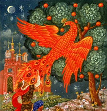
Congratulations, Leon, on bringing your beautiful visions into cinematic life. Your respect for fairy tale author Sophie Masson, an esteemed member of the Australian Fairy Tale Society, shines through in your interview with her. It’s also delightful how you’ve drawn upon the influence of The Lady and the Unicorn tapestry, and art of the Pre-Raphaelite movement. Congratulations on your achievements at such a young age. May your artistry continue to blossom. – Fey regards from Louisa John-Krol, Vice President of the Australian Fairy Tale Society, and avid reader of Sophie’s novels.
LikeLike