
Check out this fun little trailer for Sabina and the Cats of Rome!
forthcoming books
First advance review for Sabina and the Cats of Rome!
The first advance review of Sabina and the Cats of Rome has just appeared, and it’s absolutely lovely! The review is by Brenton Cullen and has appeared in Books+Publishing this week. Here’s a short extract (full review is for B+P subscribers only):
Masson’s storytelling is engaging and accessible, offering simplicity for independent reading while maintaining a rich plot. Laura Wood’s black and white illustrations bring Sabina and Cleo to life, depicting seven scenes from the story...
It’s a great start for this fun little chapterbook, which is coming out with Christmas Press in October.

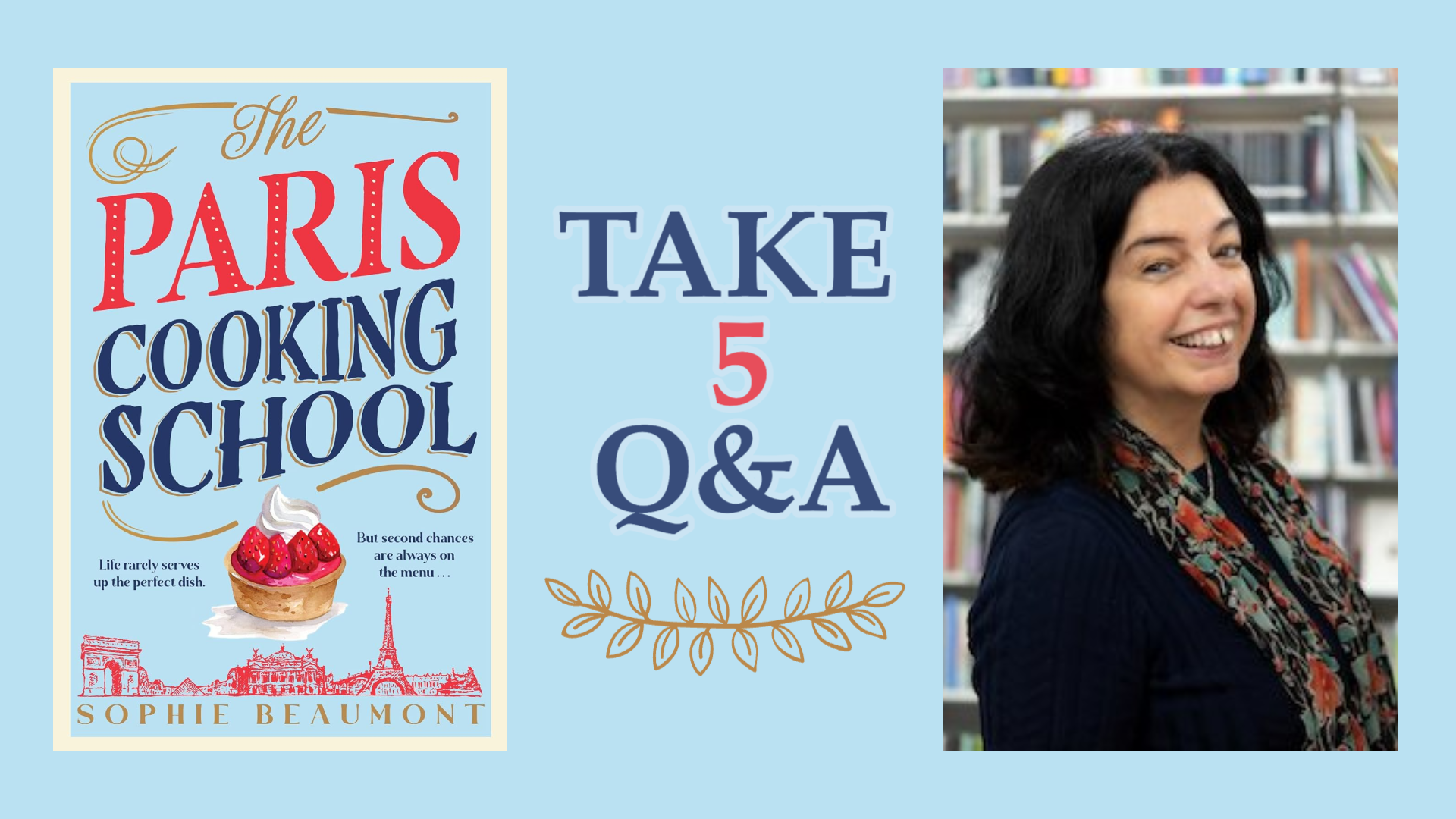
Ahead of the imminent release of The Paris Cooking School in the US and Canada…
The Paris Cooking School comes out on August 6–not long to wait!–in the US and Canada, published by Alcove Press, and in the lead up to that, and to whet your appetite, there’s a great ‘Take Five’ interview with me on Writer Unboxed, the fabulous, award-winning US-based international writing blog. Here’s a short extract:
Q1: What’s the premise of your new book?
SM: My book, The Paris Cooking School (written under the pen-name of Sophie Beaumont) is an adult contemporary novel set, you guessed it, in Paris 😊 It features three main characters, Kate Evans, Gabi Picabea and Sylvie Morel, who are all at crossroads in their lives. Gabi and Kate have both come for the month-long course at Sylvie’s Paris Cooking School, after major crises in their lives—in Kate’s case, a bitter marriage breakup, in Gabi’s case a crippling creative block. Meanwhile, Sylvie is facing a worrying online harassment campaign targeting her business, and trouble from her commitment-shy lover Claude. What the three women find during that extraordinary April in Paris will change the course of their lives—and bring new love, too. Set against a gorgeous background of Paris in spring, and studded with delicious references to French food, it’s a novel that Australian readers have already taken to their hearts, and which I hope North American readers will just as much! The book comes out in the US and Canada on August 6, published by lovely Alcove Press.
You can read all the interview here.
The ARCs of A Secret Garden in Paris are out!
Lovely to see, on my return from France the other day, the ARCs (Advance Reading copies) of A Secret Garden in Paris–exciting to hold it in book form, even if it’s not yet final!

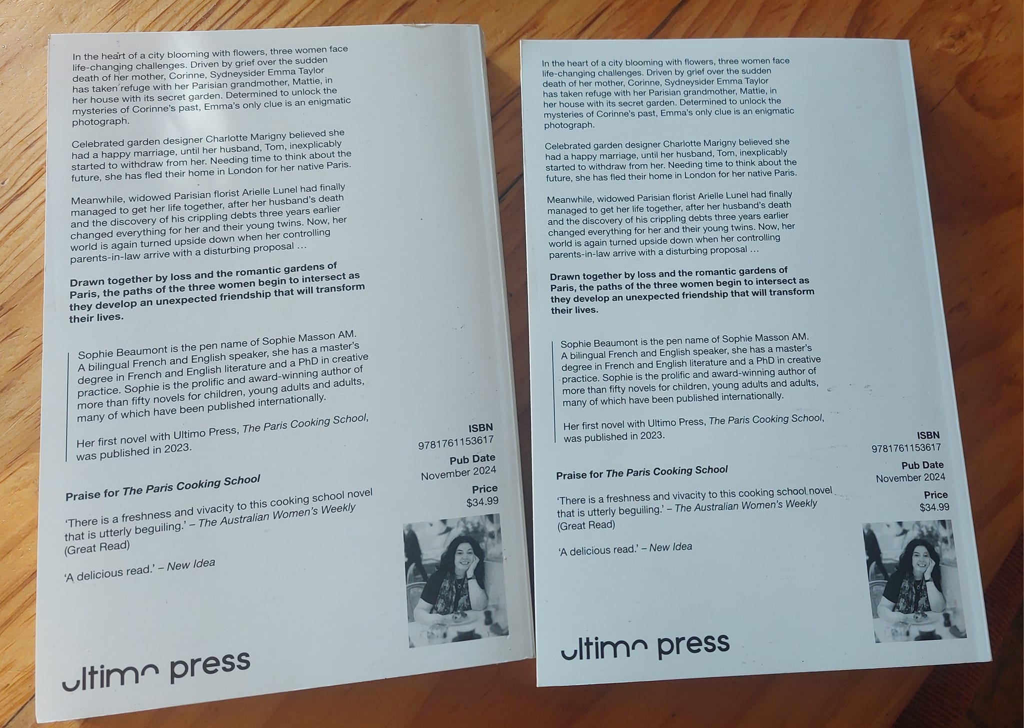
Cover reveal for A Secret Garden in Paris!
I am thrilled to reveal the gorgeous cover of A Secret Garden in Paris, my second novel under the name of Sophie Beaumont, which will be out in October with Ultimo Press. Isn’t it just absolutely beautiful!
Here’s the blurb:
Springtime in Paris … the perfect time to turn over a new leaf
In the heart of a city blooming with flowers, three women face life-changing challenges. Driven by grief over the sudden death of her mother Corinne, Sydneysider Emma Taylor has taken refuge with her Parisian grandmother, Mattie, in her house with its secret garden. Determined to unlock the mysteries of Corinne’s past, Emma’s only clue is an enigmatic photograph.
Celebrated garden designer Charlotte Marigny believed she had a happy marriage, until her husband Tom inexplicably started to withdraw from her. Needing time to think about the future, she has fled their home in London for her native Paris.
Meanwhile, widowed Parisian florist Arielle Lunel had finally managed to get her life together, after her husband’s death and the discovery of his crippling debts three years earlier changed everything for her and their young twins. Now, her world is again turned upside down when her controlling parents-in-law arrive with a disturbing proposal…
Drawn together by loss and the romantic gardens of Paris, the paths of the three women begin to intersect as they develop an unexpected friendship that will transform their lives.
From the author of The Paris Cooking School comes a captivating story of loss and love, romance and revelations – and the pleasures of a secret Paris garden.
You can pre-order the book here.
Announcing A Secret Garden in Paris!
I have had to keep this exciting news quiet for quite a while, so now I’m absolutely delighted to be officially able to share it with you!
Ultimo Press will be publishing A Secret Garden in Paris, my second novel under my pen-name of Sophie Beauumont, in November!
Here’s the official announcement from Ultimo Press:
Quelle surprise! ![]()
![]()
![]() It’s time to pack your bags for a new Parisian adventure!
It’s time to pack your bags for a new Parisian adventure!
We are thrilled to be publishing A Secret Garden in Paris by Sophie Beaumont ![]()
![]() It’s a captivating story of unexpected revelations, romantic discovery, hope—and the pleasures of a hidden green world in the heart of Paris. Ooh la la!
It’s a captivating story of unexpected revelations, romantic discovery, hope—and the pleasures of a hidden green world in the heart of Paris. Ooh la la! ![]()
Sophie says, ‘Something that’s always struck me about Paris whenever I’ve been there: its many gardens, offering vistas to admire, havens to take refuge in, places to play in, moments to draw breath in. But not all of them are well-known or obvious, and you might come across a green oasis in a little backstreet square or down some narrow stone steps or hidden behind an unassuming door. And Paris loves flowers, decks itself in them, revels in them…So you see, how could I resist?’
A Secret Garden in Paris will publish in November 2024.The deal was brokered by Margaret Connolly.
Writing about my characters against the joyful background of the gardens of Paris has been an absolute delight, and I hope everyone who loved The Paris Cooking School–and everyone still to discover it–will take this book to their hearts too!

Advance copies of The Paris Cooking School!
A lovely surprise arrived yesterday: a box full of my advance copies of The Paris Cooking School. So good to hold it in my hands! It looks absolutely gorgeous, and feels it, too, with lovely embossing on the title with the satiny feel of the cover..can’t stop touching it 🙂
Thank you so much to all the wonderful Ultimo Press team for such a beautiful production–I am so delighted and just can’t wait for it to come out and for readers to hold it in their hands! (Publication date is on November 1).
The arrival of the box also coincided with the first (advance) Goodreads review of the book: and it’s a lovely five-star one, by Marianne Vincent. Thank you so much, Marianne!

Video about The Paris Cooking School
Here’s a little video on the Ultimo Press You Tube channel in which, as Sophie Beaumont, I talk about The Paris Cooking School, its characters and settings. Hope you enjoy!
Cover reveal of The Paris Cooking School!
Absolutely thrilling–my publisher has just revealed the gorgeous cover of my forthcoming adult novel The Paris Cooking School, written under my pen-name of Sophie Beaumont, and to be published by Ultimo Press in November. Isn’t it beautiful–and how about that perfect strawberry tart!
(Really love the way the book is described too: sumptuous, romantic, escapist. And delectable!)
Here’s the blurb:
Life doesn’t always serve up the perfect dish, but second chances are always on the menu
There’s nothing quite so beautiful as Paris in the spring; and when you add in the chance to learn the French way of food, in a relaxed and friendly atmosphere, who can resist? Not Gabi Picabea or Kate Evans who have come from Australia to Sylvie Morel’s Paris Cooking School.
Both are at a crossroads, and learning to cook the French way in Paris, far away from all their troubles, seems like the perfect escape.
Still bruised from a shocking betrayal by her ex-husband, Kate is trying to find a new place for herself in life, and emotional peace, while French-Australian artist Gabi is struggling with a crippling creative block.
Meanwhile, Sylvie herself is facing challenges of her own – a mysterious harassment campaign against the School and a reassessment of her relationship with her commitment-shy lover Claude.
For each of the women, that extraordinary April in Paris will bring unexpected twists and transformations that will change the course of their lives.
A delectable novel about love, hope and the consolations of the perfect strawberry tart, The Paris Cooking School is a treat for the soul.
The Paris Cooking School will publish in November 2023. Pre-order from your local bookshop, or online, or via the Ultimo website, here.

Fabulous first review for The Key to Rome!
The Key to Rome, my historical mystery novel for middle-grade readers set in Roman Britain, has just got its first review, one week ahead of official release, and it’s an excellent one! It’s reviewed by Heather Zubek in the West Australian. Here’s what she said:
A dying man’s promise, a mysterious key, and a dangerous journey in ancient times; The Key to Rome is a story that will keep you reading until way past your bedtime. Set in the Roman Province of Britannia in AD84, the story sees 12-year-old Livia keeping a promise to her dying father to deliver a key to her estranged uncle. Along her perilous journey, Livia meets Mato, a boy who needs to see his dying mother before it’s too late. Together the two travellers make their way through ancient lands where they learn that the key may hold a dreadful secret. Multi award-winning author Sophie Masson has created a thrilling historical adventure that not only excites but teaches us about the troubled times in which the story is set. For ages 9+.
A great start for the book–thank you, Heather!

